This article will guide you through an overview of the client card and some of the newer user interface (UI) principles & functions. The client card can be found by navigating to the ‘Case Details’ screen located on the right-hand side of a case.
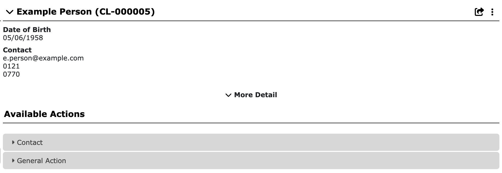
The screen details will look like this:
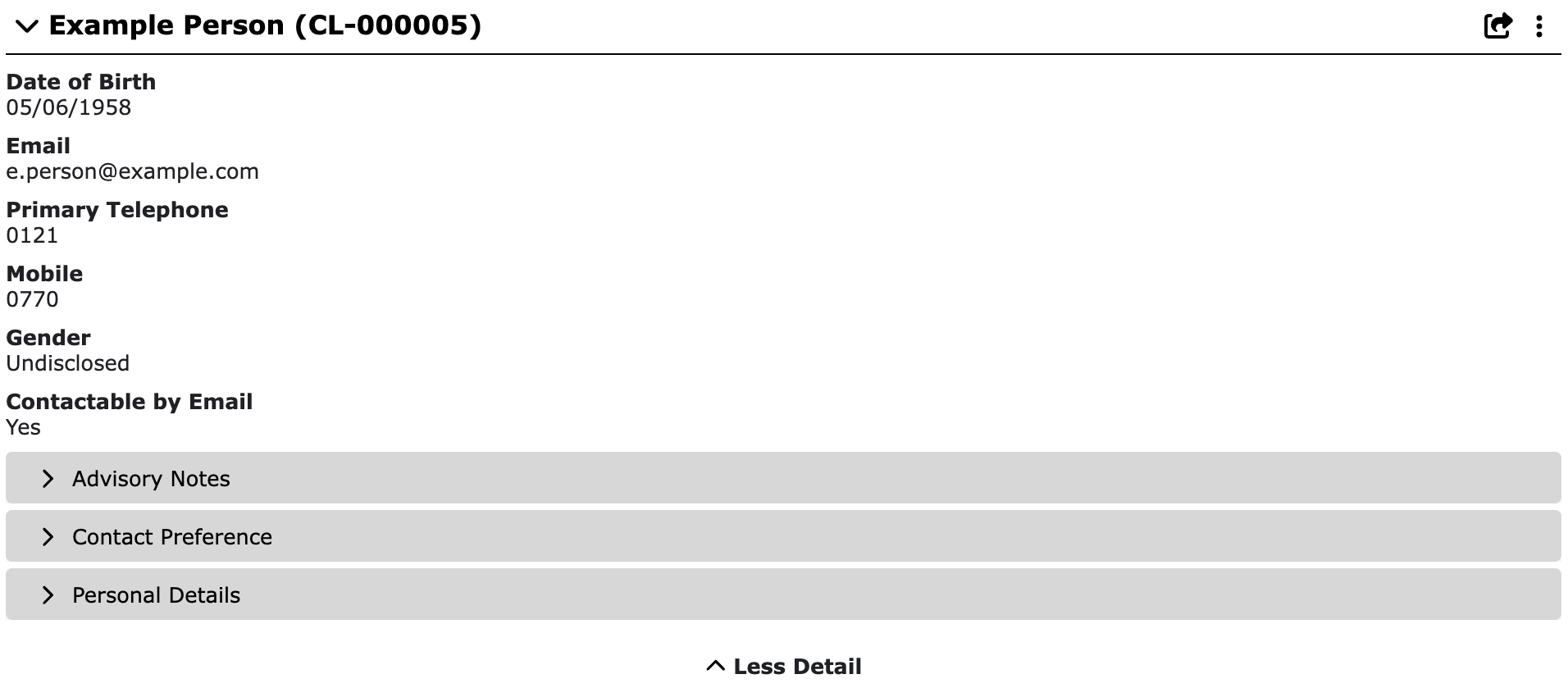
More Detail
Selecting the ‘More Detail’ dropdown will expand the client card, showing additional information including any custom fields captured from case creation.
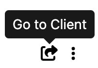
Quick Navigation Arrow
At the top right of the client card, next to the three dot menu is a bold arrow icon. This icon allows for quick navigation to the client details page.
This screen displays all the details about that particular client as well as all cases, relationships, letters etc recorded for that client.
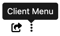
Client Menu (Three Dot)
Next to the arrow icon is a three dot clickable menu. This is the ‘Client Menu’. Clicking these three dots will prompt the menu to display an additional option such as:
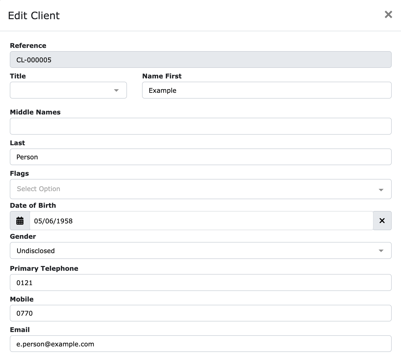
- Edit - Allowing you to edit the details about the client (All fields are the same as Client Creation)
As always, if you have any questions or concerns please reach out to us at support@iizuka.co.uk.


Ricky Astle
Comments